When analysing a homepage or category grid page, focus on making changes that will get more visits to the product detail page.
When analysing a product detail page, focus on making changes that will increase the amount of visits that will click the add to cart button.
On the cart – what’s going to get more clicks on checkout?
In check out – what’s going to get more clicks on the order submit button?
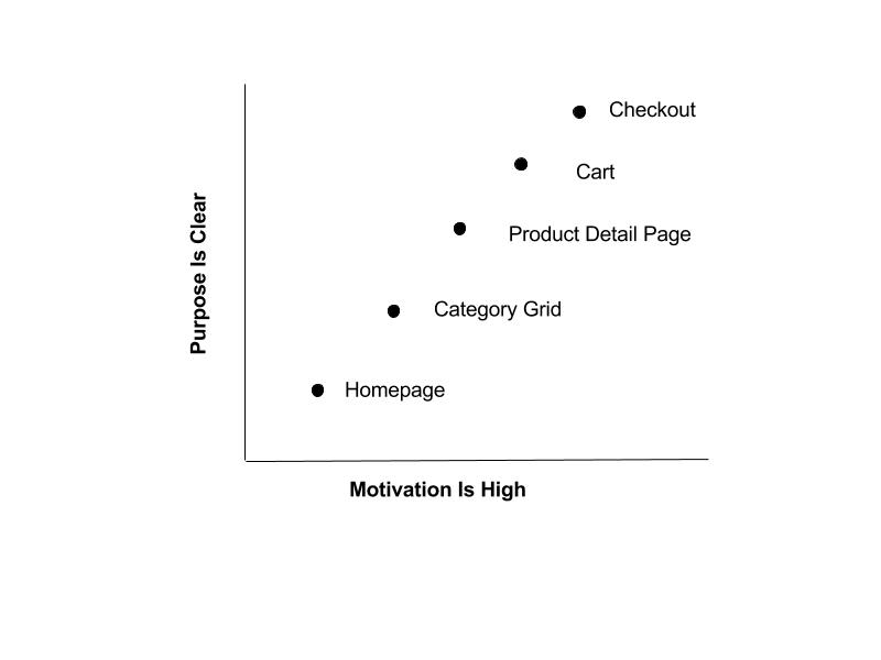
There is plenty to do to decrease friction and increase motivation on each site section to get visitors from one step to the next. The best way to prioritize is to work backwards. When a visitor first gets to the site, their purpose is very unclear, there are a million different reasons why that visitor showed up—how do you optimize for that? By comparison, when a user is in the checkout process, their motivation is high and their purpose is clear – they want to checkout with the items they’ve selected. So the ideas of what to do to increase checkout conversion are easier to get to: improve the form fields, decrease distraction, increase confidence.
