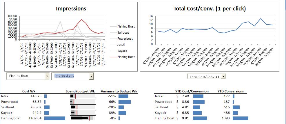
The “spend/budget wk” in-cell graph was made using Sparklines and a tutorial on how to make the interactive line charts can be found here. (You can download the Excel file below and play around with it too.)
I’m going to walk you through how to use this dashboard and hopefully discover some insights along the way:
Going counter-clockwise through the report allows you to dig deeper into what is going on and hopefully make some actionable insights.
Starting with the graph in the upper right, you can switch between any of the metrics at a higher up account total level. Lets say you’re looking at the cost/conversion view and notice that cost/conversion has been around $8 for a while and then in the last few weeks it has risen to $9 and above. Let’s see if we can figure out the reason.
Moving to the next graph to the left, you can set the first drop down to highlight a particular campaign and then in the next drop down you can choose which metric you want to focus on, in this case I want to look at Avg. CPC to see if any campaign is going up in cost making the cost/conversion go up. Flipping through the different campaigns I can see that they are all pretty even except that the Fishing Boat campaign jumped up in Avg. CPC over the last few weeks.What happened?
Leaving the first dropdown highlighting the Fishing Boat, I can now switch between the different metrics associated with the Fishing Boat in the next drop down. It looks like impressions have been going up, possibly to seasonal demand, and clicks have been going up right along with it together showing CTR maintaining at that same 3% range. But when impressions and clicks went down again, presumably after demand has fell off in July, you can see cost/conversion start to jump higher and higher.

Is it possible that bids were increased to keep up with demand but as soon as demand fell off, those bids weren’t decreased at the right time to adjust for that change in demand? Insight – try lowering your bids!
You can also see conversion rate drop a percentage point from the beginning of July to the end of July for the Fishing Boat campaign. Is it possible that many of the keywords that convert well during the peak of impressions at the start of July don’t work as well towards the end? Look in AdWords for bad performing keywords.
Have you noticed that the Sail Boat campaign has the 2nd lowest Avg. CPC, highest conversion rate and the second highest amount of conversions? This campaign is kicking butt! Is there more you could do to maximize it, ad more keywords, up bids, etc.? Take a look at it’s landing pages, what is it doing that the others aren’t?
Below the graph on the left is a Cost and Budget chart. As long as your cost/conversion is at an acceptable amount you want to make sure you arn’t hitting your daily budget. In this screen shot you can see that the Fishing Boat is getting close so you may want to increase it’s budget.

In the next chart over you can see the total conversions and total cost/conversion. Although the Fishing Boat campaign has the highest amount of conversions it also has the highest cost/conversion. The powerboat account has the lowest amount of conversions and the highest cost/conversion. It might be a good idea to go back to the upper left data graph and look at the different metrics around Powerboat to see if anything can be improved.
Here’s the Excel file for the PPC Dashboard, feel free to download and play around with it yourself and let me know what you think!

